| Copyright July 1, 2000 | Vern Lindberg |
Part I Uncertainties and Error Propagation |
Part III The Vernier Caliper |
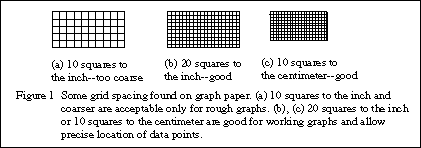
In this course you will make graphs using regular and logarithmic graph paper. Since these will be working graphs you will need to purchase graph paper. Purchase paper which has 20 squares to the inch or 10 squares to the centimeter. Coarse graph paper is not acceptable! Under no circumstances purchase "quadrille paper", even if it is mislabeled "graph paper." Figure 1 shows some good and bad choices of graph paper. Figure 5, 6, and 7 are shown on proper graph paper.
Computer generated graphs are only acceptable with the prior permission of your instructor. Some graphing packages still make "connect-the-dot" lines which is totally unacceptable. Others provide a smooth line passing through all the points, which is generally not what we want. You will be required to make graphs on regular graph paper during lab exams so get in practice with the labs.
Graphing packages will produce graphs very quickly, however the user must still adjust the axes and enter information for labels. If you are allowed to use computer graphs be sure to create graphs that are large (at least 7x 9 inches) and that have fine grid lines to make it easy to read values from the graph. A working computer graph should look as close as possible to a graph produced on regular graph paper. Some examples of graphs generated within Excel are included in Figures 5, 7, and 8. Comments on their limitations will be made later.
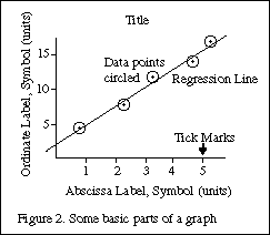
a) The horizontal axis is called the abscissa and the vertical axis is called the ordinate. You can use the terms horizontal and vertical just as well.
b) The graph must have a title which clearly states the purpose of the graph. This should be located on a clear space near the top of the graph. A possible title for a graph would be
"Figure 1. Variation of Displacement With Elapsed Time for a Freely Falling Ball."
The title should uniquely identify the graph --you should not have three graphs with the same title. You may wish to elaborate on the title with a brief caption. Do not just repeat the labels for the axes!
| "y vs t" | The title should be in words and should not just repeat the symbols on the axes! |
| "Displacement versus time" | This title is in words, but just repeats the names on the axes. The title should add information. |
| "Data from Table 1" | Again, this adds minimal information. It may be useful to include this information, but tell what the graph is and what it means. |
c) Normally you plot the independent variable (the one over which you have control) on the abscissa (horizontal), and the dependent variable (the one you read) on the ordinate (vertical). If for example you measure the position of a falling ball at each of several chosen times, you plot the position on the ordinate (vertical) and the time on the abscissa (horizontal.) In speaking of a graph you say "I plotted vertical versus horizontal or ordinate versus abscissa". If you are told to plot current versus voltage, voltage goes on the abscissa (horizontal).
d) The scale should be chosen so that it is easy to read, and so that it makes the data occupy more than half of the paper. Good choices of units to place next to major divisions on the paper are multiples of 1, 2, and 5. This makes reading subdivisions easy. Avoid other numbers, especially 3, 6, 7, 9, since you will likely make errors in plotting and in reading values from the graph.
The zero of a scale does not need to appear on the graph.
Computer plotting packages should allow you control over the minimum and maximum values on the axis, as well as the size of major and minor divisions. The packages should allow you to include a grid on the plot to make it look more like real graph paper.
e) Tick marks should be made next to the lines for major divisions and subdivisions. Look at the sample graphs to see examples. Logarithmic scales are pre-printed with tick marks.
f) Axis label. The axes should be labeled with words and with units clearly indicated. The words describe what is plotted, and perhaps its symbol. The units are generally in parentheses. An example would be
| Example Displacement, y, of ball (cm) |
On the horizontal axis (abscissa) the label is oriented normally, as are the numbers for the major divisions. The numbers for the major divisions on the vertical axis are also oriented normally. The vertical axis label is rotated so that it reads normally when the graph paper is rotated 1/4 turn clockwise. See the sample graphs for examples.
Avoid saying Diameter in meters (x 10-4) since this confuses the reader. (Do I multiply the value by 10-4or was the true value multiplied by this before plotting?) Instead state Diameter (x 10-4meters) or use standard prefixes like kilo or micro so that the exponent is not needed: "Diameter (mm)".
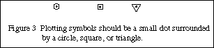
g) Data should be plotted as precisely as possible, with a sharp pencil and a small dot. In order to see the dot after it has been plotted, put a circle or box around the dot. If you plot more than one set of data on the same axes use a circle for one, a box for the second, etc., as shown in Figure 3.
If we have the guidance of a theory we can choose our plot variables accordingly. If we are using data for which we have no theory we can empirically try different plots until we arrive at a straight line. Some common functions are listed in Table 1 along with plots which yield straight lines.
| FORM | PLOT (to yield a straight line) | SLOPE | Y-INTERCEPT |
| y = a x + b | y versus x on linear graph paper | a | b |
| y2 = c x + d | y2 versus x on linear graph paper |
|
|
| y = a xm |
or y versus x on log-log paper |
|
a (at x = 1) |
| x y = K | |
|
|
| y = a ebx | or y (on log scale) versus x on semi-log paper |
|
a |
* Special techniques are needed when using logarithmic graph paper. These will be discussed in a later section.
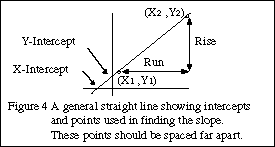
The capital forms of Y and X are chosen to represent any arbitrary variables we choose to plot. For example we may choose to plot position, x, on the Y-axis versus mass, m, on the X-axis, so we need different symbols for our general case. Refer to Figure 4 to see what is being done.
We choose two points, (X1,Y1) and (X2,Y2), from the straight line that are not data points and that lie near opposite ends of the line so that a precise slope can be calculated. (Y2-Y1) is called the rise of the line, while (X2-X1) is the run. The slope is
Eq. 1 |
Slope has units and these must be included in your answer!
The point where the line crosses the vertical axis is called the intercept (or the Y-intercept). The intercept has the same units as the vertical axis. The equation of the straight line with Y on the vertical axis and X on the horizontal axis is
Eq. 2 |
The line can be extended to cross the horizontal axis as well. The value of X where this happens is called the X-intercept, with the same units as variable X, and will be used only rarely.
If the line goes directly through the origin, with intercepts of zero, we say that Y is directly proportional to X. The word proportional implies that not only is there a linear (straight line) relation between Y and X, but also that the intercept is zero.
Consider the data in Table 2 which are plotted in Figure 5 . The points are carefully plotted (see the next section for the explanation of the bars on the data points), and we see that the points do not fit perfectly a straight line. Since we expect some uncertainties in the measurements, this is not surprising.
The solid line drawn on the graph is the "best" fit to the data. Each person could have a different line for the best fit.
| |
|
| |
|
| |
|
| |
|
| |
|
| |
|
| |
|
| |
|
The horizontal and vertical dashed lines show points chosen to determine the slope. Notice that they are far apart, spanning the graph. The rise and run are determined and the slope is calculated as
The intercept is read from the intersection of the line with the vertical axis and is.
Intercept = - 0.68 cm.Thus the line is
Position = (2.09 cm/s) Time - (0.68 cm)It is good practice to check that this equation is correct by picking a time and seeing if the equation predicts the correct position. If I choose a time of 4.5 sec the equation predicts a position of 8.72 cm and the graph shows a position of 8.75 cm. The equation seems to be correct.
Figure 5(a) The hand drawn graph has been reduced from its original size.
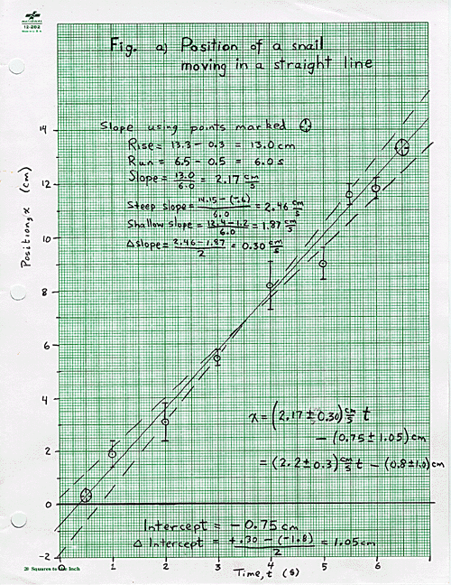
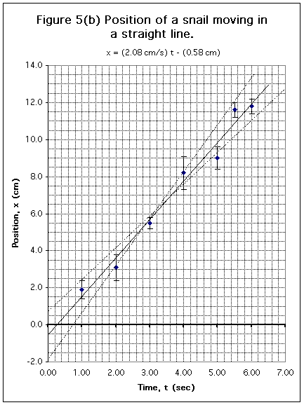
Figure 5(b) This graph was done in Excel 98 on a Macintosh computer. Instructions on how to make this plot in Excel are included in the download. Download Excel 98 Source. (should work on WINTEL or MAC)
Data that you plot on a graph will have experimental uncertainties. These are shown on a graph with error bars, and used to find uncertainties in the slope and intercept. In this discussion we will describe simple means for finding uncertainties in slope and intercept; a full statistical discussion would begin with "Least Squares Fitting."Consider a point with coordinates X ± ΔX and Y ± ΔY.
(a) Plot a point, circled, at the point (X,Y).(b) Draw lines from the circle to X + ΔX, X - ΔX, Y + ΔY, and Y - ΔY and put bars on the lines, as shown in Figure 6(a). These are called error bars.
(c) The true value of the point is likely to lie somewhere in the oval whose dimension is two deviations, i.e. twice the size of the error bars.
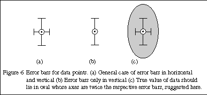
The oval shown in Figure 6(c) shows the uncertainty region (at 95% confidence--this is statistics speak). It is not usually drawn on graphs. Often the error bars may be visible only for the ordinate (vertical), as Figure 6(b). Draw the best error bars that you can! If they cannot be seen, make a note to that effect on the graph.
Once the graph is drawn and the slope and intercept are determined we wish to find uncertainties in the slope and intercept. Refer to Table 2 and Figure 5(a) to see the procedure. Data are plotted on this graph with error bars shown. The uncertainty in time is so small that no horizontal error bars are visible.A solid line is shown which best fits the data and has a slope of (2.09 cm/s) and an intercept of (- 0.68 cm) (on the vertical axis). Using the error bars as a guide we have drawn dashed lines which conceivably fit the data, although they are too steep or too shallow to be considered best fits. This is a judgment call on your part.
The slopes of the dashed lines are 2.32 cm/s and 1.79 cm/s. Half the difference of these is 0.27 cm/s which we take as the uncertainty in the slope of the best line. We round off the uncertainty to the proper number of significant figures, and round the slope to match, resulting in
slope = (2.1 ± 0.3) cm/s .The differences between the best slope and either of the extreme slopes should equal the uncertainty in the slope. Here the differences are (2.09 - 1.79) = 0.30 cm/s and (2.32 - 2.09) = 0.23 cm/s, which are basically the same as the ±0.3 cm/s above.We try to make the three lines cross in the middle of our data. If we draw them this way we can determine the uncertainty in the intercept. The dashed lines have intercepts of -1.52 cm and +0.20 cm and half of the difference between these is 0.86 cm which we use as the uncertainty in the intercept.
Intercept = (-0.7 ± 0.9) cm.It is more difficult to do this on the computer graph, but we can try as is suggested on Figure 5(b). On the Excel download I show lines and calculations resulting in an uncertainty in slope of +/- 0.4 cm/s and uncertainty in intercept of +/-1.2 cm. Also on the Excel spreadsheet I show a statistical analysis of the line resulting in a standard error of 0.13 cm/s in slope and 0.55 cm in intercept. Doubling these to get to 95% confidence results in values close to what we get graphically.
Even if we lack error bars we use the same approach to find the errors in slope and intercept. Using this method it is possible to get good estimates of uncertainty in the slope and intercept. Generally you will have less confidence in the intercept uncertainty.
The process described in parts (b) and (c) above estimates the statistical procedure of finding standard errors in the slope and intercept. Statistics programs will allow this to be done automatically (in Excel see the LINEST function). The values of uncertainties you get by visual estimation will be similar to the values obtained by a full regression analysis.
| Abscissa | The horizontal axis. Usually the independent variable is plotted on the abscissa. See ordinate. |
| Axis Label | Each axis is labeled with the name of the variable, possibly the symbol of the variable, and the units. |
| Dependent Variable | The variable which we do not control, but only measure. Normally it is plotted on the vertical or ordinate. See independent variable. |
| Directly Proportional | A linear relationship with an intercept of zero. A graph of a linear relationship passes through the origin. |
| Error Bars | Vertical and/or horizontal marks indicating the possible range of values in a graph point. Usually one standard deviation long. |
| Graph Paper | Finely divided grid on which graphs can be drawn. Typically 10 squares to the inch, 20 squares to the inch, or 10 squares to the centimeter. Other types of graph paper exist. See quadrille paper. |
| Independent Variable | The variable over which we have control. Normally it is plotted on the horizontal or abscissa. |
| Intercept | For linear or semi-log graphs, the value of the ordinate (vertical) coordinate of a graph when the abscissa (horizontal) is zero. For log-log graphs, the value of the ordinate when the abscissa equals 1. It is also called the Y-intercept. It has the units of the ordinate. See slope, X-intercept, Y-intercept. |
| Log-Log Paper | Both axes are logarithmic scales. The divisions are marked on the paper and cannot be changed except to move the decimal point (tick mark 2 can be 0.02, 0.2, 2, 20, etc.) Special techniques are used to find slope and intercept. |
| Ordinate | The vertical axis. Usually the dependent variable is plotted on the ordinate. See abscissa. |
| Quadrille Paper | Usually a coarse grid (4 squares to the inch) useful for making engineering drawings, but not suitable for graphs. See graph paper. |
| Rise | The difference in the vertical coordinates of two points used to find the slope. The points should be far apart. See run. |
| Run | The difference in the horizontal coordinates of two points used to find the slope. The points should be far apart. See rise. |
| Scale | The choice of how many graph paper squares will represent 1 unit of the data. To allow easy reading of the graph choose 1 unit = 2, 5, or 10 squares. |
| Semi-Log Paper | Graph paper with one axis (usually the horizontal) that is linear and one (usually vertical) that is logarithmic. The divisions on the log scale are marked and cannot be changed except to move the decimal point. Special techniques are used to find slope and intercept. |
| Slope | The quantity M in the straight line equation Y = MX+B, it equals Rise/Run and usually has units. See intercept. Special techniques are used to find slope and intercept on graphs with log scales. |
| Tick Marks | Marks that extend into the margins of the graph paper to show exactly where the division label (number) is to be applied. See examples on graphs in this manual. |
| Title | The title of a graph should include a Figure number, and useful information about what is being plotted. It should not just repeat the axis labels. |
| X-Intercept | For linear or semi-log graphs, the value of the abscissa (horizontal) coordinate of a graph when the ordinate (vertical) is zero. For log-log graphs, the value of the abscissa when the ordinate equals 1. It has the units of the abscissa. See slope, Intercept, Y-intercept. |
| Y-Intercept | Another name for the intercept. See the definition there. See slope, Intercept, Y-intercept. |