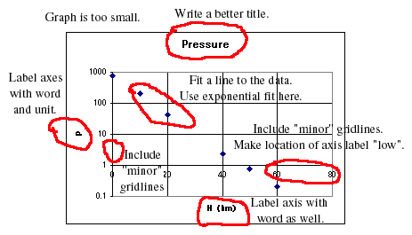
1. The graph is too small.
2. There should be minor gridlines more closely spaced.
3. There should be a good title.
4. Axes should be labeled with name of quantity and unit, for example, "Pressure, P (Torr)."
5. The horizontal axis label should be at the bottom. Do this by double clicking on the axis, and choosing "Patterns", "Tick Mark Labels Low".
6. Fit the data with a line. Do this by "Chart", "Add trendline exponential", then "Options", "Display equation on chart." The equation will use y and x as variables, and have no units. You can edit this equation to include units and proper symbols.
Here is a corrected version.
