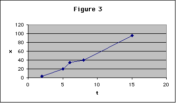
 1. The figure is too small!
1. The figure is too small!
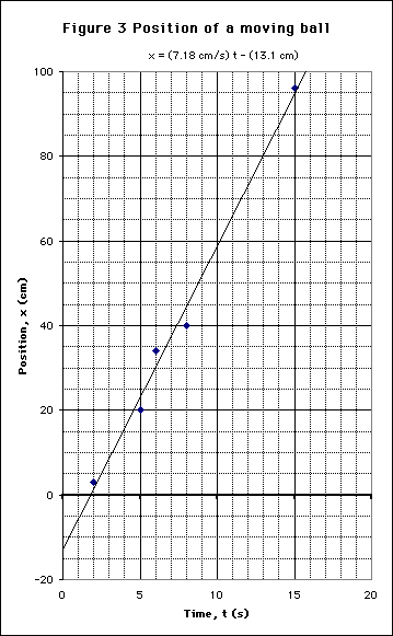
2. A much better title is needed.
3. The axes should be labeled with name and units.
4. A linear fit should be made to the data, not "connect the dots."
5. Gridlines should be on both axes, and should be finely spaced.
6. Bill Gates likes to have the plot area shaded gray. This is not the normal scientific procedure which leaves the area white.
7. The equation of the fit should be on the graph.
Here is an improvement.