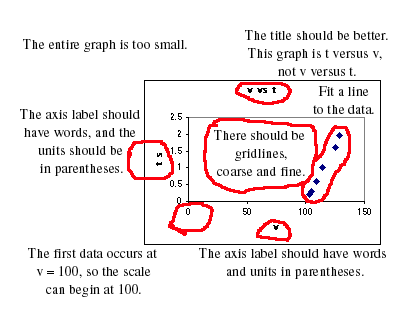
1. The graph should occupy most of a sheet of paper. This is too small.
2. A better title is needed. It should be written in words and should explain the significance of what is plotted, not just repeat the axis labels.
3. The title here says v versus t, but what is plotted is t versus v.
4. Axis labels should have the name of the variable in words, not just symbols, and the unit inside parentheses. For example, "Time, t (s)."
5. There should be gridlines to make it easy to read data from the graph.
6. On the velocity axis, the data run from 100 to 130, so the velocity axis can start at 100. The 0 does not need to be on the graph.
7. A line should be fit to the data, and its equation given. Under "Chart" choose "Add trendline", "Linear", and "Options-Display Equation". Once the line is in place you can edit it to insert the correct variable symbols and units.
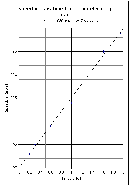
Below is a corrected version of the graph.